2026-06-28
The best sizes for Instagram, Stories and Facebook posts
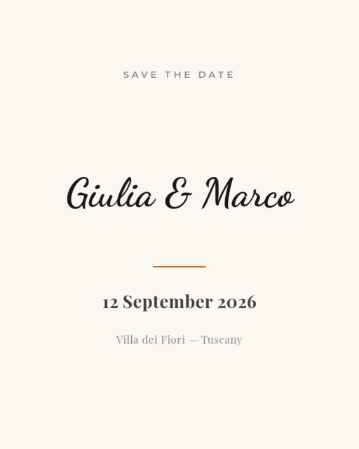
Using the right dimensions keeps your post crisp and avoids awkward cropping that cuts off your text. Here's a simple, up-to-date cheat-sheet you can bookmark — every size below is available in Postzmaker as a one-tap preset.
Instagram feed
- Square — 1080 × 1080: the safe choice that works everywhere.
- Portrait — 1080 × 1350: fills more of the screen as people scroll, great for reach and engagement.
Stories & Reels covers
- 1080 × 1920 (9:16): full-screen vertical, for Stories and as a cover for Reels.
- Feed post — 1080 × 1080 (square) or 1200 × 630 for link posts.
- Shared link preview — 1200 × 630: the classic landscape ratio.
LinkedIn & X (Twitter)
- Landscape — 1200 × 630 works well for both.
- Square — 1080 × 1080 also performs nicely in the feed.
Why the right size matters
Upload the wrong ratio and the platform crops it automatically — often slicing off part of your headline or logo. When you design at the exact size the platform uses, what you see on the canvas is exactly what your audience gets. No surprises, no re-uploads.
Understanding aspect ratio (the number behind the size)
Every size above is really an aspect ratio — the relationship between width and height — scaled up to a comfortable pixel count. 1080×1080 is 1:1 (a square). 1080×1350 is 4:5 (portrait). 1080×1920 is 9:16 (the tall full-screen shape used for Stories and Reels). 1200×630 is roughly 1.91:1 (landscape). Once you think in ratios, the pixel numbers stop feeling random: they're just a convenient resolution for each shape.
Why aim for 1080px on the short side rather than smaller? Because platforms compress uploads. Starting from a larger, crisp file gives the compression something good to work with, so your final post looks sharp instead of soft. Going much bigger than 1080–1440px rarely helps for social — it just makes a heavier file.
Safe zones: keep the important stuff away from the edges
Different placements cover different parts of your image. In an Instagram Story, the top is partly hidden by your profile bubble and the bottom by the reply bar, so keep headlines and logos within the central band. In feed posts, the corners are usually safe, but text that sits right against an edge looks cramped and risks being cut on certain screens. A reliable habit: leave a margin of roughly 8–10% around the whole canvas and never let critical text touch the border.
What actually happens when the ratio is wrong
Upload a wide landscape image to a feed that expects a square and the platform does one of two things: it crops your image to fit (slicing off the sides, often taking your text or logo with them) or it letterboxes it with empty bars that waste space and look unpolished. Neither is good. This is why designing at the destination ratio matters more than the exact pixel count — get the shape right and cropping simply never happens.
How to re-adapt one design for several sizes
Made a great square post and now want a Story version? You don't start over. Duplicate the idea onto the taller canvas, then rearrange: move the headline up into the safe zone, let the photo fill the extra height, and give the text more vertical space. The elements are the same — the layout breathes differently. Designing the widest and the tallest versions of a key post lets you cover the feed and Stories from a single concept, keeping your message consistent across placements.
A few more platforms worth knowing
- Pinterest: 1000×1500 (2:3) — tall pins get more visibility.
- YouTube thumbnail: 1280×720 (16:9) — bold text, high contrast, readable when tiny.
- TikTok / Reels cover: 1080×1920 (9:16), same as Stories.
- X (Twitter) inline image: 1600×900 (16:9) displays cleanly.
A real example: one photo, three placements
Imagine a photographer announcing a mini-session. From a single portrait photo they make three assets: a 1080×1350 feed post with the date and a booking prompt; a 1080×1920 Story with the same photo full-bleed and a “Swipe up / link in bio” line near the middle; and a 1200×630 image for a Facebook link post so the website preview looks intentional. Same shoot, same message, three correct shapes — nothing cropped, everything on-brand.
Square or portrait? How to decide
For Instagram, the honest answer is: portrait (4:5) usually wins for reach, because it occupies more screen height and slows the scroll. But square (1:1) has its own advantages — it's predictable, it never gets awkwardly cropped in grids or previews, and it's the most flexible if you plan to reuse the same image on other platforms. A simple rule of thumb: if the post is meant to stop people in the feed, go portrait; if it needs to look tidy in your profile grid or be repurposed elsewhere, go square. When you're unsure, design square — it's the safest common denominator, and you can always extend it to portrait later.
File format matters too
Size is about dimensions, but the file type affects how your post looks and loads. Export a PNG when your design has crisp text, sharp edges or flat colors — it stays perfectly clean. Choose JPG when the post is mostly a photograph and you want a smaller file. WebP gives you photo-like quality at an even smaller size, which is handy if you're uploading many images. Whatever you pick, keep the resolution at full size and let the platform do the compression — never scale a small image up, because that's what makes posts look blurry.
The easy way
Instead of memorizing numbers, just open Postzmaker, tap the size you need from the presets (Square, Portrait, Story, Landscape), design your post, and export at full resolution. You can switch the canvas size whenever you like, so adapting a design for another platform takes seconds rather than a fresh start.
Bookmark this page, or better yet, open the editor and try a couple of sizes to see which fits your content best.