2026-06-14
How to create a quote post that gets shared
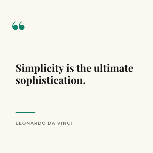
A good quote card is simple, readable and instantly shareable. It doesn't need a photo or fancy effects — it needs clarity. This short guide shows you how to make one for free.
Step 1 — Pick a strong, short quote
The best quote posts are one or two lines. If it's too long, it becomes hard to read at a glance and less likely to be shared. Trim it to the essential idea.
Step 2 — Start from a quote template
Open a quote layout — the typography and spacing are already balanced. Just replace the text with your quote and the author's name.
Step 3 — Keep it clean and high-contrast
- Use a plain background or a soft color so the words are the hero.
- Big text, generous margins, one accent color.
- Add the author's name in a smaller size underneath.
Step 4 — Stay on brand
Use the same colors and fonts you use everywhere else, or save them in your brand kit. Consistent quote cards make your whole feed look intentional and recognizable.
Step 5 — Export and post
Download a square (1080 × 1080) PNG and share it. Quote posts travel well — people save and repost the ones that are clean and easy to read.
How to choose a quote worth posting
Not every nice sentence makes a good quote card. The ones that get shared tend to do one of three things: they say something the reader already feels but couldn't put into words, they reframe a familiar idea in a fresh way, or they're genuinely funny. Before you design, ask: would someone repost this to say something about themselves? People share quotes as a form of self-expression, so a line that helps them signal their values or humor will always travel further than a generic platitude. If a quote makes you nod or smile, it's a candidate; if it makes you shrug, keep looking.
Length and punctuation matter
The sweet spot is short — usually between four and fifteen words. A quote you can read in one glance gets absorbed instantly; a paragraph makes people scroll on. If your quote is long, see whether trimming a clause makes it punchier without losing the meaning. Keep punctuation clean and honest: don't add quotation marks that weren't there, and use an em dash before the author's name. Small details like consistent capitalization make the card feel polished rather than hasty.
Attribute it correctly
Getting the attribution right protects your credibility. Misattributed quotes spread fast on social media, and posting one can make you look careless. If you're not certain who said it, do a quick check or write “Unknown” rather than guessing a famous name. When you do know the author, give them a clear, smaller line beneath the quote — it adds authority and looks intentional. If the words are your own, that's great too; original lines in your voice build your brand more than borrowed ones.
Typography is the whole design
A quote card has almost no other elements, so the font choice is the design. Serif fonts (with little feet on the letters) feel classic, literary and trustworthy — perfect for reflective or timeless quotes. Sans-serif fonts feel modern, clean and direct — great for bold statements and motivational lines. A reliable trick is to pair two: a characterful font for the quote itself and a plain, small font for the author's name. Give the text generous line spacing so it breathes, and let it dominate the canvas — a quote should feel confident, not cramped.
Plain background or photo?
Both work, but they say different things. A solid or softly gradient background keeps all the attention on the words and feels calm and premium — ideal when the quote is the whole point. A photo background adds mood and context, but only if the words stay readable, which means a darker overlay and simpler imagery. As a rule, thoughtful or literary quotes shine on clean backgrounds, while lifestyle or travel quotes suit a photo. When in doubt, go minimal; it's harder to get wrong.
Themes that consistently perform
- Motivation and mindset — Monday mornings are made for these.
- Industry-specific wisdom — a quote your niche audience recognizes builds authority.
- Gentle humor — a relatable, funny line gets tagged and shared to friends.
- Customer words — turning a real review into a quote card is social proof and a quote in one.
Turn one quote into a series
A single quote card is nice; a recognizable series is a growth engine. Pick a theme and a fixed look — same background style, same font, a small consistent label like “Monday Motivation” or “Quote of the Week” — and publish on a regular rhythm. When your audience learns to expect it, your quotes become appointment content that people look for and reshare out of habit. The design work is front-loaded: once you've made the first one and saved it as a draft, every future edition is a two-minute text swap. That combination of consistency and low effort is exactly what keeps a series going long enough to build a following.
A small note on originality
Reposting famous quotes is fine, but the accounts that stand out eventually mix in their own words — a lesson from their work, a phrase a customer used, a small truth from their niche. Original lines can't be found on a hundred other feeds, so they carry your voice and are more likely to be attributed back to you when shared. Treat quote cards as a chance to practice saying what you actually think, clearly and briefly. Over time, that's how a quote series turns into a recognizable point of view.
Ready to make one? Open the editor, pick a quote template, and design a card worth sharing.