2026-06-02
How to design a sale or promo post that converts
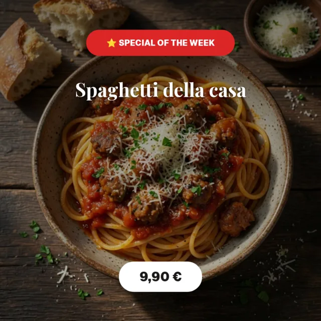
A promo post has one job: get people to act. That means the offer and the call to action have to be impossible to miss. Here's how to design a sale post that actually converts — for free.
Step 1 — Lead with the offer
Put the discount or deal front and center: “-30%”, “2 for 1”, “Free shipping”. Make it the biggest thing on the canvas. If people have to hunt for the offer, they scroll past.
Step 2 — Show the product (or the vibe)
Add a photo of what's on sale, or a background that matches the mood. Keep it clean so the offer still dominates. A badge or price tag element makes the deal pop.
Step 3 — One clear call to action
- Tell people exactly what to do: “Shop now”, “Link in bio”, “Use code SALE20”.
- Add urgency if it's real: “Today only”, “Ends Sunday”.
- Use a contrasting color for the button or CTA so it stands out.
Step 4 — Export and schedule
Download your post as a PNG and publish it, or save a draft so you can reuse the layout for your next promotion. Consistent promo designs build recognition over time.
The psychology behind a good offer
People don't act on information; they act on feeling plus a reason. A promo post works when it makes the value obvious and gives a low-friction reason to move now. That's why “Save €10” often beats “10% off” for smaller prices — a concrete number feels more tangible than a percentage. It's why “Free shipping” can outperform an equivalent discount, because shipping fees are a known annoyance you're removing. Before you design, decide the single feeling you want: relief (a problem solved), excitement (something new), or fear of missing out (limited time). The whole post should serve that feeling.
Order of importance: offer, then reason, then action
A converting promo has a clear reading order. The offer is the hero and should be the biggest thing on the canvas. Just beneath it comes the reason to care — what the product does, or who it's for — in a supporting size. Last comes the call to action, small but unmissable, telling people exactly the next step. When these three fight for attention with equal sizing, the post feels loud but says nothing. When they're ranked, the eye flows from “what” to “why” to “how,” which is exactly the path to a click.
Use urgency — but keep it honest
Urgency and scarcity are powerful because they push a decision from “later” (which usually means never) to “now.” “Ends Sunday,” “Only 20 left,” “Today only” all work. The catch is that fake urgency destroys trust the moment people notice the “24-hour sale” has been running for three weeks. Only claim a deadline or a limit that's real. Honest urgency converts and builds credibility; invented urgency converts once and costs you the follower.
Show the price clearly
Hiding the price to “get people to click” usually backfires on social — it reads as evasive. If the deal is good, show it. A common, effective pattern is to display the old price with a strike-through next to the new price, so the saving is visible at a glance. Put the price in a badge or a contrasting shape so it pops off the design. Clarity is persuasion: the easier you make it to understand the deal, the fewer people talk themselves out of it.
Make the call to action impossible to miss
Your CTA should sit in a color that contrasts with everything around it — if your design is warm, a cool button jumps out, and vice versa. Keep the words to an action: “Shop now,” “Get the deal,” “Use code SUMMER.” If there's a promo code, make it large and easy to copy. On social you can't always link directly, so tell people precisely where to go: “Link in bio,” “DM us,” “Tap the sticker.” Removing that last bit of guesswork is often the difference between a save and a sale.
Three promos, three approaches
- Percentage sale: lead with the big “-30%,” show a couple of products, add “Ends Sunday.” Clean and urgent.
- Buy-one-get-one: the headline is the mechanic itself — “2 for 1 all week.” Show two items side by side so the deal is instantly legible.
- New-product launch: less discount, more desire. A striking photo, a short benefit line, and “Now available — link in bio.” You're selling newness, not a price.
Common promo mistakes to avoid
- Burying the offer in a paragraph instead of making it the headline.
- Two or three competing calls to action — pick one.
- A gorgeous design where the price or code is somehow the smallest thing.
- Fake countdowns that reset — audiences notice and disengage.
Timing and repetition beat a single perfect post
Even a great promo rarely works from one post alone. People miss things, scroll fast, and need a couple of reminders before they act. Plan a small sequence: an announcement when the sale starts, a reminder in the middle, and a “last chance” near the deadline — each with the same look but a slightly different message. Post at the times your audience is actually online, and don't be afraid to reuse the design; consistency reads as confidence, not repetition. The seller who politely reminds three times almost always outperforms the one who posts once and hopes. Save your promo as a draft so each reminder is a quick edit rather than a fresh design, and keep the offer, the deadline and the call to action identical across the sequence so the message stays crisp. Repetition done tastefully doesn't annoy people — it's simply how you make sure the ones who were interested don't miss their chance.
Got a sale to announce? Open the editor, start from a promo template, and design a post that gets clicks.