2026-06-20
How to make an Instagram Story for free
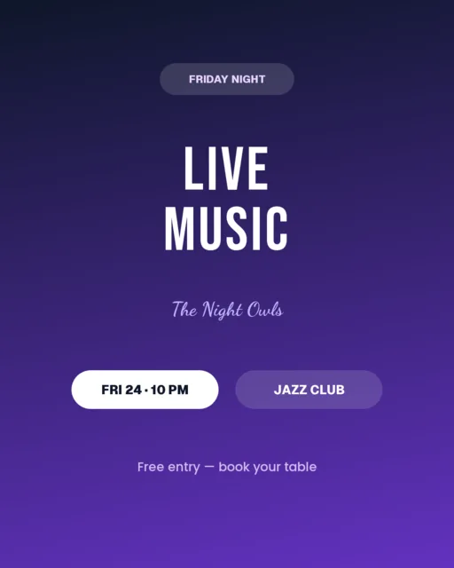
Stories are vertical, full-screen and fast-paced — which means the design has to be big, bold and instantly readable. The good news: you can make a great Story for free right in your browser, with no app to install and no watermark. Here's how.
Step 1 — Start at the Story size
Open the editor and pick the Story preset: 1080 × 1920 (9:16). Designing at the exact size means your text and stickers won't get cut off by the safe zones at the top and bottom of the screen.
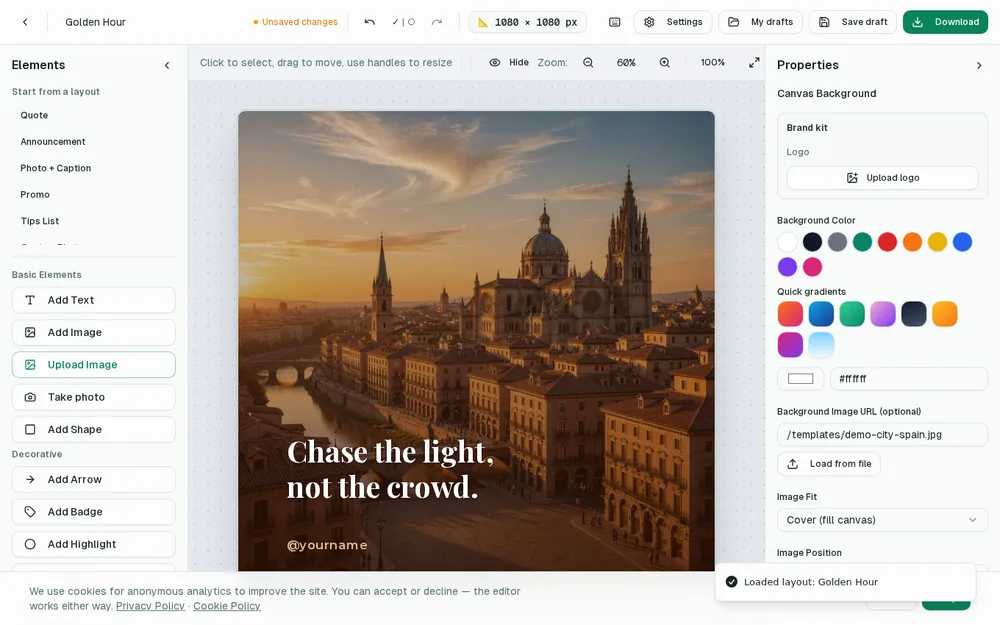
Step 2 — Go big with one message
Stories are watched for a second or two, so keep it to a single idea: a quote, an announcement, a question, a product. Use a large headline and leave the middle of the screen clear so nothing important hides behind the profile icon or the reply bar.
Step 3 — Add your photo or a color background
- Upload a photo and let it fill the screen, or
- Use a solid color or gradient background for a clean, modern look.
- Drop a subtle overlay behind your text so it stays readable over any image.
Step 4 — Download and share
Export a PNG at full 1080 × 1920 resolution, save it to your phone, and add it to your Story like any photo. Because it's already the right ratio, it fills the screen perfectly.
Respect the Story safe zones
A Story looks full-screen, but the app covers parts of it with interface. At the top sits your profile picture and name; at the bottom sits the reply box, the “Send message” bar and, on Reels, the caption and buttons. If you place a headline too high or a call to action too low, the app hides it. The fix is simple: imagine a margin of about 250 pixels at the top and 300 at the bottom, and keep anything you need people to read inside that central band. The middle third of the screen is prime real estate — put your most important words there.
Design for a moving, tapping viewer
Feed posts are studied; Stories are tapped through in seconds. That changes how you design. Use fewer words and a bigger size than you would in a feed post — a Story headline can be huge and still feel right. Because people hold their thumb near the screen ready to skip, give them a reason to pause in the first half-second: a bold statement, a surprising number, a question. If your Story needs squinting, it's already been tapped away.
Tell a story across multiple slides
The real power of Stories is sequence. Instead of cramming everything into one frame, spread it across three or four that build on each other. A classic structure: slide one hooks (“We almost didn't launch this…”), slide two adds context, slide three delivers the point or the offer, and a final slide gives the call to action. Each frame should work on its own but pull the viewer to the next. Designing them as a set in the same colors and fonts makes the sequence feel intentional rather than random.
Leave room for stickers and interaction
Stories are interactive, and the native stickers — polls, quizzes, question boxes, countdowns, sliders, link stickers — are what drive replies and taps. When you design your background, leave a clear, uncluttered space where a poll or a link sticker can sit without covering your text. A common mistake is filling the whole frame with a busy graphic, then having nowhere to place the interactive element. Plan the empty spot on purpose; that gap is where engagement happens.
Three Story ideas to try
- Behind the scenes: a quick photo of your workspace or process with one honest line of text — followers love the unpolished, human side.
- Launch or restock: a bold “It's here” frame, a detail frame, and a link-sticker frame that sends people to buy.
- Mini tutorial: a three-slide tip sequence in your niche, saved to a Highlight so it keeps working for weeks.
Save Stories to a Highlight
Stories vanish after 24 hours, but the good ones don't have to. Group your best Stories into a Highlight on your profile — “Menu”, “Reviews”, “How to order” — and they become a permanent, tappable mini-brochure for anyone who visits. Design those evergreen Stories a little more carefully, since they'll be seen for months, not a day.
Keep a consistent Story look
When your Stories share a visual style — the same accent color, the same font, a small logo in the same corner — people start to recognize your content before they even see your name. This consistency is what turns scattered posts into a brand. You don't need rigid rules; just pick two fonts and a small palette and reuse them. Saving these in a brand kit means every new Story starts from the same visual language, so building a recognizable presence costs you no extra effort. Over a few weeks, that repetition is what makes casual viewers feel like they know you.
Watch what works and do more of it
Stories give you honest, immediate feedback. If people tap away quickly on a certain type of frame, that's a signal; if a particular Story gets replies, forwards or link taps, that's a template worth repeating. You don't need fancy analytics — just notice which of your Stories spark a reaction and lean into that format. The creators who improve fastest are simply the ones paying attention to their own results. Try one small experiment at a time — a different opening frame, a shorter caption, a poll instead of a question box — and keep whatever earns more taps and replies. Small, steady adjustments compound into a Story style that consistently holds attention.
That's a professional Story in a few taps. Open the editor, choose the Story size, and design yours now.